BILT Speaker

BILT Speaker
RevitCat - Revit Consultant

Monday, 18 December 2017

Weird Railing Stuff - part 10 - Split railings

[Edit:  Revit 2019 has a new feature that allows you to split a railing - but all it does is to break the selected railing into two separate pieces that no longer relate to each other.  They can then be separately edited.   But just supposing you wanted to have a single railing element that has a gap in it?  Read on . . . .]
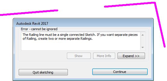
Have you ever tried to create a Revit railing with a split or break in it?  You'd have seen the warning that tells you it is not possible in Revit:

Split Revit Railings

Well, there is a way to do it - yes you can split railings (with lots of provisos, of course).
WARNING: this is another crazy workaround, so use it with caution . . .

In this example, a railing runs through a column, which is not desirable


You may want to break the railing and have a gap either side of the column

The first thing to do is edit the path of the railing, remove the top segments and stop it short of the column by say 50mm.


Once the top part of the railing is removed, Tab-select the 'Top Rail' (or Handrail) - it is important to select one of these sub-elements, not the overall railing.  NB. if your railing does not have either of these sub-elements, this technique won't work (eg. old style top rails)

Once selected, click on 'Edit Rail'

Then click on 'Edit Path' for the Top Rail

This will allow you to add lines to either the top or bottom end of the Top Rail element; but first it is important to set the workplane depending on whether you are adding to the beginning/bottom or end/top.

Select the name of the workplane.   I don't think that either of the 'Pick' options work here.

The workplane will be parallel to the first or last segment of the overall railing - so you'll need to work in either a 3D view or an elevation/section view.  It may be easier to start in 3D so that you can see exactly what you are doing and where.

This command is not explicit about what is going on - in fact Revit is waiting for you to draw some lines, which will become extensions to the Top Rail (or Handrail)

These lines do not need to be directly linked to the ends of the Top Rail - in fact they can be almost anywhere (in the same plane as the end of the Rail).  Start drawing a line the other side of the column from the end of the railing;  at this stage it may be easier to go into a section/elevation view to ensure that it aligns with the railing on the other side of the stair (but keep an eye on the active workplane).

Trace over the other railing (it should snap to it).

Once the Top Rail extension is complete, it will have a gap where the column is.


Be warned:  This is an extension to the Top Rail only - so balusters will not be attached to the underside of the extension.

Supports will not be attached to a Top Rail, so if you require supports on the extension, make sure before you start that your railing has a 'Handrail' sub-element, and add the extension to the Handrail, not to a Top Rail.  If you switch the railing to a type that does not have a Top Rail, the entire extension will disappear (if it was attached to a Top Rail in the first place).  Plan ahead!


Not surprisingly, this workaround is fiddly and not particularly robust - but I am showing it just in case it helps someone out.  In this example, it would probably have been much easier (and safer) to have two separate railings, but it might give people ideas about a use for this technique, so go for it.

Downsides:
  • Only works with a Top Rail or Handrail in the railing
  •  Top Rail and Handrail extensions are not interchangeable
  • Top Rail cannot host supports
  • Will not host balusters or posts beyond the split
  • Will not turn corners in plan
  • Will not automatically adjust heights/angles if the stair changes
  • Is quite confusing for anyone not familiar with railing extensions

Sunday, 3 December 2017

Weird Railing Stuff part 9 - Handrail supports on Multistorey Stairs

At first sight it seems that the new Multistorey tools in Revit look like a significant improvement over the old method.  However, as you delve deeper, there are some new problems that have been introduced with the new feature.

Weirdness #1

Once a regular component stair has been converted to multistorey that process cannot be reversed.  There is no command to 'Reset Stair' or 'Convert back to single storey'.  You can go to the 'Disconnect Levels' command, and select the other levels - this reverts it to a 'Single Storey Multistorey stair' - but it still identifies as a multistorey stair in the properties


So what, you might think?  Well, you can manipulate a multistorey stair by tab-selecting the stair inside the 'multistorey group', but that could be very confusing.  The more significant issue is what it does to railing supports:

Weirdness #2 Railing Supports

If you have a stair that has railing supports, and then you convert the stair to Multistorey it does something strange to the supports.  The original level stair railings behave normally - you can select a railing support and it will be pinned.

You can unpin individual supports then move them, swap to a different type or delete them


On the other levels, you can select the supports but they do not have a pin icon.  However, you can actually move, copy or delete them;  what you cannot do is swap their type (it is greyed out); nor can you change the hand clearance property.  They are in effect in some middling state between pinned and unpinned.

If you modify any of the railing supports, you can 'Reset' the railing so that all moved or deleted supports are reinstated to their original position.  Copied supports vanish.   

You might expect that supports on the original stair railing would become pinned again.  Well, not exactly:

Weirdness #3

If you 'Reset' the railing on the original stair level, it actually converts it to the strange middling state where none of the supports are pinned any more but there are reinstated to the original locations.


The moral of this tale is that you should probably try to adjust all the supports before you convert a stair to multistorey, especially if you want to swap any support types.  If that is not possible, you may still be able to do what you need to the supports after making the stair multistorey - notwithstanding all the other painful issues with railing supports.  One thing is sure - you will be confused.

More on this subject:

Sunday, 12 November 2017

Scheduling Wall Heights in Revit

One of the new features in Revit 2015 was the ability to schedule wall heights - well, sort of.  More Wall parameters could be scheduled than previously:

  • Base Constraint
  • Base Offset
  • Top Constraint
  • Top Offset
  • Unconnected Height
What was not included in this list was "Top is Attached" or "Base is Attached". 
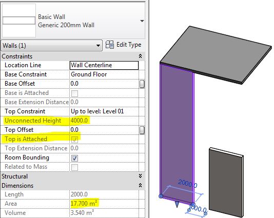
This is really worrying because it means that when a wall is attached at top or bottom, the "Unconnected Height" is almost certainly going to be displaying a false value in the properties dialog box, and in the schedule.  

Unattached wall with correct Unconnected Height property

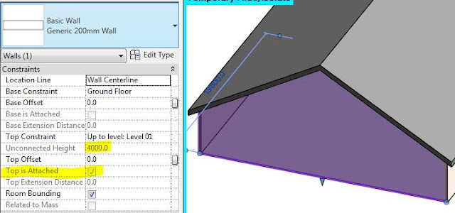
Attached wall top with wrong Unconnected Height property
In the properties dialog you can see those "Attached" checkboxes so it might alert you to the issue, but that does not help in a schedule, as you cannot display those properties there.

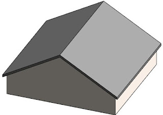
This also occurs when a wall has been attached to a gable end roof (or any angled roof)


Edit Wall Profile

The same problem could also happen if a wall has had its profile edited - again the wall heights could be scheduling false values. 

This is not so simple to pick, as there is no property for "Profile is edited" - however, Revit knows if it has been edited or not because it displays a "Reset Profile" icon in the ribbon if a selected wall has had its profile edited .

 Schedules


Basically, when you schedule wall heights using the 'Unconnected Height' property, it could be a pack of lies!  If we could also schedule the "Attached" properties of a wall, then we could use the schedule to identify attached walls, and perhaps use conditional formatting to highlight possible false height values.


One alternative solution is to create a calculated value of Length x Unconnected Height to get the supposed area;  this can be compared to the actual reported area (built-in property).  If they are different then you know that the wall has been either attached or had its profile edited - therefore the 'Unconnected Height' property is unreliable.


You could take this a step further by adding a comparison calculation

You could then do some conditional formatting to make any dodgy wall heights easily apparent


One other thing you could do is reverese engineer the height by adding a calculated Average Height - This would only be accurate for rectangular walls, as those with sloping tops or edited profiles would still not be accurate - hence the use of the word 'Average' in the calculation name.  I would use this solution with caution - perhaps only where walls have accidentally been attached to floors above.


Attach Walls to Edited Floor Sketches?


One of the reasons that all of this is likely to be an issue for all of you is that when you edit a floor, Revit always asks if you want to attach walls below it.  The default answer is 'Yes', which means that a lot of walls will end up being accidentally attached to floors above - meaning that your wall heights will be wrong in schedules.  Wouldn't it be better if the default answer was 'No' and even better still if this dialog box never, ever appeared.

Please vote for this Revit Idea to encourage Autodesk to do something about this.

Thursday, 2 November 2017

Weird Stuff with Revit Shared Parameters

When you create a suite of similar parametric families (say windows), you will define a series of parameters that control the families in the project - it may be dimensions, visibility switches etc.  If those are instance parameter, there is a really important choice you have to make:

  • Should they be "Shared Parameters" or just regular "Family Parameters"?

Conventional wisdom says that you only need to make them shared if you want to tag or schedule them in the project.  However, there are some other critical differences in behaviour that may affect your decision:

Did you know that when you make them 'Family Parameters', then start using the families in the project and swap them over for similar families with identical parameters - Revit loses the  data held in the instance parameters - even if the instance parameters are identically named in the families?  Aargh!!  That is not good news.  This even happens if the families were cloned from one source that already had the parameters set up.

However, if you used 'Shared Parameters' that instance property data is maintained when you swap family/types (provided that the same shared parameters are defined in each of the families).

Here is another reason for using shared parameters even when you don't need to tag or schedule them.

Sunday, 29 October 2017

New in Revit 2018.2 - Pattern Dialog Box


Following on from my last post about new features in Revit 2018.2, there are some very nice tweaks to the Pattern dialog boxes:

Fill Patterns

  • The Fill Pattern dialog box is now fully resizable (height & width) - Revit remembers the resize operation during the session.
  • The Fill Pattern dialog box has been redesigned to replace text icons with visual icons - as per many other Revit dialog boxes.
Revit 2018.2 dialog box
 
Old dialog box

  • No Pattern <None> is now at the top of the list (when accessed from a dialog box that has the option to remove a pattern, such as the Material dialog box) - this replaces the 'No Pattern' button at bottom left of the old dialog box.
  • Solid Fill is now second from the top of the list (Drafting patterns) after 'No Pattern' - generally I think this is a good thing.  NB. This is not the case with the Override dialog boxes, which have not yet been redesigned - so we have another new inconsistency.

  • There is now a Search/Filter function for patterns - it will filter the list to only include whatever contains the text you type into the 'Search' box.  It is not case sensitive.    Watch out for this feature:  if you have any text in the search/filter box, you may not see the <None> or Solid fill items at the top - it will take some getting used to, and will surely catch you out a few times.
  • It is now possible to select multiple fill patterns when the dialog box was accessed from the Manage toolbar (but not from dialogs that require you to choose a fill pattern to be used somewhere - like the material dialog box);  If multiple fill patterns are selected, they can be deleted but not edited (the edit icon is greyed out).

Edit Fill Patterns

The Edit Fill Pattern dialog box has been redesigned - the new overall layout is more logical:
Revit 2018.2 Edit Pattern dialog box
Old Edit Pattern dialog box

  • 'Simple' patterns are now labelled as 'Basic' 

  • When listing custom patterns from a pattern file, it shows 4 instead of 3.  When the dialog box is resized vertically, it only increases the size of the preview, not the list of custom patterns, so you still need to use the tiny scroll bar on the right.
  • The 'Import' button (on the left) has been replaced by a 'Browse' button (on the right) - why?
  • The Import Scale value has been unlocked so it can be changed at any time after importing - this sounds great but BIM Managers may not be happy as they will lose the ability to set and lock down pattern scales.
  • Changing the scale without re-importing is immensely useful, as we often do not know where the pattern came from.  In this situation,  the preview updates as soon as you change the scale.
  • We have lost the File Units -  Aaaargh!  Why?  I like to know if the source was metric or imperial.
  • As with the old dialog box, we cannot see the name of the imported pattern file, which would be useful.
  • We now have a search/filter function for custom patterns, which operates much like the one on the Fill Pattern dialog box - this only works immediately after importing a pattern file. 
  • The title 'Settings' seems a bit odd when the pattern is set to custom - it was obviously designed for Basic/simple patterns, where it is more appropriate.

Overall, this is a welcome change to the UI, with only a few minor quibbles.  It would be great to have many, many more such minor improvements that incrementally take away the pain of using Revit.

Friday, 20 October 2017

New in Revit 2018.2 - Family Types Memory

Here we are with a third set of enhancements for Revit this year - first version 2018, then 2018.1 and now 2018.2

There is nothing amazing - just small things as Autodesk themselves say.  I have tested a couple of things and have some comments on the first of them:

Remember Column width spacing in Type properties dialog

This one is in the Family Editor - in the Family Types dialog box (the one with four blue squares, which I never remember the name of).
When you open that dialog box, the column widths are never arranged how you want them:  The formula width is too small if you want to add formulas; the 'Lock' column is always too wide etc.
In previous versions, after you had rearranged the widths, then closed the dialog box, the next time you opened it, those darned column widths were back to standard.  In addition to this, when you make the dialog box wider, all the column widths expand; if you make the first column wider it often seems to make the 'Lock' column wider too (ridiculous for a checkbox), and then you get a very irritating horizontal slider on the dialog box - pretty soon the left hand columns disappear off screen when the focus goes into a formula . . . .

In Revit 2018.2, they have addressed just one of those problems - but only partially:  Yes, the column widths are remembered when you reopen the dialog box - sounds great but . . . .
Standard column widths

When you adjust the column widths, you have to be careful to make sure that the vertical divider line to the right of the 'Lock' title does not disappear -
Adjusted column widths to make formulas readable

Once the right hand Lock column divider disappears, you get the scroll bar along the bottom of the dialog box.  Once the whole Lock column disappears, and you put the focus in the Formula column, it shifts the Parameter Name column off screen to the left.

 If you adjust the dialog box width, it is possible to make formulas and values readable - but watch that Lock column width
Adjusted dialog box width

In version 2018.2 they have broken something in the controls for adjusting the widths and sliding the scroll bars - it is pretty flaky.  Within 10 minutes of testing I had managed to entirely lose the Lock column, so you couldn't see it even with the slider fully to the right.   I have reported this as a bug, and Autodesk have replicated the problem, so hopefully they are fixing it already.


The Bad News

  • The Dialog box column widths are only remembered per session (Actually that may not be so bad after all . . .). 
  • The annoying expanding Lock column is still annoying.
  • The nasty horizontal slider is still there, doing its worst to hinder you - I would much prefer it if the Lock column was always narrow, fixed to the right side of the dialog, while the other three columns scaled proportionally with the dialog box (at whatever width you set).

The Good News

  • The Dialog box column widths are only remembered per session. 

Yes, this really is good news because if you manage to screw up the widths on the dialog box, it all resets when you next start Revit.   Actually it is good news anyway, because it is most likely that you will want different alignments depending on your task, each time you open Revit.