BILT Speaker

BILT Speaker
RevitCat - Revit Consultant

Saturday, 18 May 2024

BIM History - RUN Part 2 - RUCAPS and Sonata User Newsletter

Following on from my previous post on BIM History, here are some more covers from RUN - the RUCAPS Users Newsletter.

RUN 16 - Sept 1988

The Front and back covers featured drawing competition winners from 1987 - these demonstrated the ability to generate coordinated elevation views from the 2.5/3D model.  This may not seem like a big deal nowadays but this was done 37 years ago - over a decade before Revit was born.


RUN 17 - Winter 1988

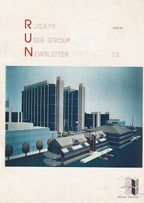
This was no longer just a RUCAPS newsletter - but for users of all  software.  This issue was sponsored by "Real Image" who specialised in generating photo-realistic images from RUCAPS & Sonata models.


RUN 18 - Spring 1989

I was editor in chief of the magazine by this stage.

We decided to publish a Technical Supplement that contained all the RUCAPS technical articles from the previous 18 issues - updated.

The front and back covers again showed examples of coordinated elevations generated from the 3D model.  In those days we did not have tools to patch up the elevation & section views (like Filled Regions or the Linework tools in Revit) - so the models had to be pretty good for it to work.


RUN 23 - Spring 1990

RUCAPS was stuck on expensive DEC or Prime mini-computers (a misnomer!) - these had very limited interaction with any other computers or software.  Sonata was running on less expensive  hardware  - Unix workstations from Apollo and Silicon Graphics.  With the increasing use of Sonata the drawings and images were becoming more sophisticated. 

By this stage I was working in Australia - still on RUCAPS, so I continued to contribute to the RUN newsletter in the UK as an international user.


The RUCAPS and Sonata User Group in Australia was very active - we held national conferences and published an Australian newsletter . . .

Sunday, 14 April 2024

BIM History - Rucaps User Group Newsletter

Although this blog is mostly about my trials and tribulations with Revit, my experience with BIM software started many years before Revit was even dreamed of.  There have been many forerunners to the current crop of BIM programs, and I had the privilege of working with two of them, which I would like to talk about lest they become forgotten in the mists of BIM history.  

The term BIM is an acronym for Building Information Modeling - that means creating a 3D geometric model that has non-geometric data attached to it.  Of course any BIM program needs to have meaningful ways of representing and extracting information, such as drawings, visualisations, schedules etc.

I also worked with quite a few 3D modeling programs (Computervision, Caddsman, Sketchup, Mac Perspective, MicroStation etc) - but they lacked meaningful "information" as part of the model.  I did try to use "Triforma" (The BIM version of MicroStation), but gave up on that and resorted to using MicroStation as a documentation system (which it was very good at) with a bit of 3D modeling thrown in.

Caddsman Architect was a really great Australian 3D modeling/documentation program, but it did not integrate well with other systems, and with so few other users out there, training was an ongoing burden. 

My first experience with BIM, back in 1981, was using "SCRIBE", which was a 3D modeling and thermal analysis program written by Cedric Green at Sheffield University - more about that in another post.  That was followed by a couple of years of manual drafting with pen and/or pencil, followed by a stint of 3D modeling with Computervision at DP Architects in Singapore.

In 1985 I started work using RUCAPS at HKPA Architects in London - this really was a precusor to modern BIM programs.  Although it technically worked in 2.5D we were able to create 3D views, 2D drawings and details;  it also had the capability to attach rudimentary information - and it did allow basic scheduling of components and quantities (after a fashion).  Although some might dispute the use of the word "Information" for RUCAPS, I maintain that it did happen.  Of course it was superseded by such products as Sonata.  All of this is documented elsewhere - on Wikipedia and various articles here and there.

RUN - RUCAPS User Group Newsletter

One of the good things I found about RUCAPS was the strength of the User Group, particularly in the UK and Australia - they had regular meetings and a newsletter that evolved into an international magazine.  I became involved in the user group and with running the newsletter (RUN) - first as a technical editor, and later as overall editor.

The earliest edition I have found reference to was RUN 3 in November 1984 - so I'm guessing the first edition was early 1984.  My involvement started with writing many articles, particularly from 1987 (RUN 11) onwards.  When I joined as technical editor, the overall editor was Andrew Postlethwaite (of Shepherd Robson Architects); the overall coordinator and marketing consultant was Jo Hunting (of t² Ltd) - she made it all happen.

RUCAPS was initially written by John Davison and John Watts, then taken on by GMW Architects who later formed a separate company GMW Computers to sell and develop the software.  GMWC later became t² Solutions.  RUN 13 featured a ten year anniversary article by John Davison - by then Managing Director of t²:

A DECADE OF RUCAPS

ln 1972 when GMW Portnership visited the Liverpool Centre for Computer Aided Building Design to see 'Neanderthal' RUCAPS, a 1 Megobyte disk drive, stood 5 feet high by 4 feet deep by 2 feet wide. lt needed its own three phase electricol supply. could never be switched off ond never worked continuously for more thon a couple of weeks; but in those days you didn't let little things like that deter you!

By the time thot RUCAPS was first sold in 1977 you could fit 2.4 Megobytes of cartridge disc into a cabinet 9 inches high by 3 feet deep by 2 feet wide. These discs were highly reliable despite the fact that the whole cabinet shook when you tried a complex zoom.

At that time none of us were aware that we had seen the beginning of a technological revolution whlch would continue to gather momentum, just os I suppose Cro-Magnon man would not have expected his offspring to land on the moon.

By taking a last look bock at the past ten years of RUCAPS perhops we can find some a useful pointers to the next ten yeors of development.

The first RUCAPS systems were single user systems which ran on the most popular mini-computer of its day - a Digital PDPI I /34. This machine, like most powerful mini-computers of its time, was a l6-bit
computer. The discs, as I have said, were 2.4 Megabyte removable cartridge - the top one containing the RUCAPS software and the bottom one containing your project data. The screen which was also
monufoctured by Digital was an 11 inch refreshed vector disploy which did not have any memory of its own instead it used the computer's memory to store its on screen display data. This created a strong conflict for computer memory when you realise that the maximum capacity of the PDPI 1/34 was
only 64 Kilobytes in total. (For those of you who are too young to remember what Kilobytes are, then 64 kilobytes is one sixteenth of 1 Megabyte.) Every imaginoble trick to save memory had to be
employed but still the moximum number of components displayable on the VT-11 was just 50.

Todoy we might consider such a system for a small house extension, but remember that in 1977 these systems were used to produce production drawings on 400 bed hospitals, large factories and the University of Riyadh. Without SKETCH, DRWCAT, LAYOUT, COMGEN, AUTOPROD or IMAGER
and many more. the four users displayed ingenuity and tenacity where today we demand function and ease of use. But, of course, it is thanks to the successes of these pioneering users that RUCAPS has been able to develop to use modern intelligent screens and powerfuI multi-user computers.

Today, when we are constantly being made aware that we live in a time of rapid technological development, it is hard to comprehend that this was not always obvious to us, But before we begin to be
complacent, sitting in front of our Concept ond Designer workstations, who among us today can conceive of a workstation (ten yeors hence) with 80 times the capacity, or who can imogine what sort of building we will be designing on a RUCAPS system with 20 times the program at our disposal? A
fascinating thought I hope, with which to enter the second decade of RUCAPS development.

DR JOHN DAVISON


RUN 13 - Reading Town Hall RUCAPS drawings by Andy Payne of Architects Design Partnership

 
RUN 14 was sponsored by T Three - leading RUCAPS implementation consultants


RUN 15 (mid 1988) saw the introduction of Sonata, which was written by Jonathan Ingram and Murray Pearson (ex-t²).  It was then bought by t² Solutions, initially to run alongside RUCAPS - but ultimately all resources were put into the development of Sonata.  This edition included the first of many articles about Sonata:


More to follow on subsequent issues of RUN in part 2


Friday, 14 April 2023

Zoom in Family Types Dialog Box

Today I watched episode 99 of BIM After Dark, hosted by the Revit Kid.  The guest presenter was  Nicolas Catellier (Revit Pure), showing Advanced Revit Family Concepts.  However much you might think you know about Revit, there is always something new to learn.  

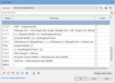
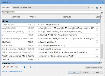
One tip that I picked up was the ability to zoom in the Family Types dialog box - this can be useful when you are editing families on a high resolution screen and the text is tiny.   Editing a complex formula is painful enough in Revit without having to squint to count the brackets at the end of a formula.

Family Editor Zoom

Just click in the Family Types dialog box, hold down the Ctrl key and use the mouse scroll wheel to zoom in or out.


There is one problem with doing this:  it plays havoc with the column widths.

  • The Lock column will most likely no longer fit in the dialog box 
  • A horizontal scroll bar may appear at the bottom of the dialog box

  • If you click in one of the formulas, it tries to display the whole formula column - which is logical
  • It also shifts everything to the left so it can display the Lock column - this is illogical and intensely irritating as you can no longer see the values.
  • You need to scroll left again to see the values

To resolve this you need to make the Formula column a bit narrower, and the Lock column much narrower (width of the checkbox).

It is not immediately obvious how to adjust the Lock column width:

  • Drag (to the left) the right-hand vertical line on the Lock column header - it seems like nothing is happening, but keep dragging it left until you align with the checkbox.

  • Drag the left-hand vertical line on the Lock column header to the right, until just before the right-hand line disappears.
  • You may need to make the Formula column narrower again until the horizontal scroll bar disappears from the bottom of the dialog box - but once you have minimised the Lock column width it should be easier to do that.


For a more detailed explanation of this workaround trick, refer to my blog post of a couple of years ago:

 Family Types Dialog Column Widths

 Thanks again to Jeff and Nicolas for the BIM After Dark presentation.


Tuesday, 15 March 2022

Stepped Stair Railing Top Rail Extension in Revit


Following on from an earlier post about stepped railings, here is a bit more information about what happens when you try to add Top Rail extensions.

Weird Railing Stuff - part 18

If the lowest boundary line on the railing path has a Slope property "By Host", the railing segment will be horizontal (assuming you have done a Height Correction on the other segments)

To add an extension to the base of the stair railing:

  • Tab-Select the Top Rail only


  • Edit its Type properties
  • Tick the checkbox for "Plus Tread Depth";  Apply or OK
  • Nothing happens
  • Revit thinks that this segment of the railing is not part of a sloping stair, even though we know it is
  • Edit the Extension Length property to 300mm
  • This time Revit adds the extension (horizontal), as expected (but still no extra tread depth, unlike the straight handrail on the other side of the stair, where it has both)


  •  Confusing huh?

Solution

To solve this, the Slope property of the railing segment must be changed:

  • Select the whole railing
  • Edit the path
  • Select the last segment of the path
  • Change its Slope property to "Sloping"

  • Finish the Path sketch
  • The Top Rail should now be sloping and have both the 300mm extension (horizontal) and the extra tread depth (sloping)

Both railings should now match


Saturday, 26 February 2022

Poor Man's Array in Revit

There are several situations in Revit where the Array tool is not available - one of those is when using the Sketch commands.  Here is a quick workaround.

Stair Sketch Example

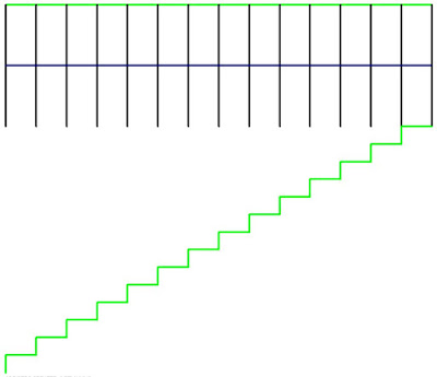
In this example I wanted to create a stepped side to a stair in the sketch mode.


When I selected two of the stepped boundary lines, I discovered to my horror that the Array tool is greyed out.

Workaround

Instead of using the Array tool, use the Copy tool, making sure that the 'Multiple' setting is ticked on the Options Bar

Revit first asks for the Start Point

Make sure to snap to the first end point of one of the items being copied

Then snap to the second end point

Then snap to the third end point - being the end of the first copy

Keep snapping to the end of the most recent copy until you have created your array - it is pretty quick once you get going.

In this example I had to delete the last created line

If you need a lot of copies - say 100, you have two choices:

  • Concentrate hard and try not to fall asleep
    or
  • Make 20 copies then stop and select all 20 steps;  copy those 5 times

Array Done!

I figured this trick out many years ago, and I needed it to achieve the stepped side to a stair sketch for another blog post - so I thought I'd document it in case it helps someone out there.

This might get you thinking about other uses of this simple technique.

I tried it for radial arrays, for which you would need to use the Rotate tool - but unfortunately that tool does not allow multiple copies.


Tuesday, 8 February 2022

Stepped Handrail on Stepped Stairs in Revit

A couple of years back I posted on how to create a stair with stepped sides


I always intended to follow it up with what happens to the handrail, and how to solve it?  Well, it is never too late.


Just in case you are wondering how to create the stepped side to the stair run in sketch mode - here is a trick for creating a DIY array in Revit.


When you create a stepped boundary for a stair run, the handrail also becomes stepped, but it is pretty clunky.


Baluster Placement

The first thing to notice is the hideous baluster placement - it is placing one at each change of direction, and one (or more) in the middle of each segment.

To tidy it up:

  • we will probably have to create a new railing type (to avoid messing up the straight railing on the other side of the stair
  • then edit the railing type properties; and the baluster placement
  • Untick the checkbox for 'Use baluster per tread on stairs'


  •  Balusters will only be placed at ends of each segment

Alternatively you could try the opposite: keep the Baluster per tread, but remove the start and end balusters - but then you lose control of the baluster locations in the segments running parallel to treads (not centred).


Top Rail Properties

You may not like the clunky Art Deco look of the vertical "Gooseneck" handrail segments, so the first step is to tab-select just the top rail (not the whole handrail) - then look at its Type properties

  • Change the Transitions from 'Gooseneck' to 'Simple' (or None)
  • Revit will give a not very helpful "not continuous rail" warning:
  • Whichever you choose (Simple or None), you get 'None', as Revit has a headache and thinks it is all too difficult, so it simply can't be bothered to join the segments

Edit Railing Segments

The next thing to try is editing the whole railing path:

  • Select the handrail
  • Edit the path

  • Select the first path segment at the base of the stair
  • Check its properties, displayed on the Option Bar
  • Change the Slope from 'By Host' to 'Sloped'

  • Finish the Sketch
  • Nothing appears to happen to the railing slope!  We will solve that later.
  • Edit the path again
  • Select the next segment that should be sloping (3rd from end)
  • Change its Slope to 'Sloped'
 
This is getting tedious, so let us try a couple of shortcut:

  • Instead of finishing the sketch to see how it looks, you could try the cool new Railing "Preview" feature in the ribbon menu (in a 3D view)


  • Tick the Preview checkbox
  • Aaaargh - it does not work when you adjust railing segment properties! It does not show the adjusted slope property.  You still have to Finish the sketch to see the effect


  •  Edit the path again
  • Select several segments to change their Slope property
  • Aaargh - the properties are not shown on the Option Bar when you select multiple segments!
  • Change the Slope properties for every alternate segment - one by one!
  • Finish the Path sketch

Something is wrong with the overall height of the railing when compared to the straight railing on the other side of the stair.  

  • This can be checked in an elevation view

Height Correction

To solve this, one way is to change the Height Correction property of each segment:
  • Edit the railing path again
  • Select the first segment
  • Change its Height Correction property to Custom; with a value to match the riser height
  • Finish the Path sketch
  • The railing height is now correct (more or less)
  • The lowest segment is now sloping

  • Check it in elevation


Now who has a headache?  Not just Revit!

This is a crazy amount of work to do in order to get this sort of correct.

Of course, you could avoid all this by just putting in a straight diagonal railing, but the point of this blog is to demonstrate the problems with stairs and railings - and to show workarounds (however nasty they may be).   There may also be situations where the diagonal railing is not appropriate - perhaps where the stepped sides are much larger steps.