BILT Speaker

BILT Speaker
RevitCat - Revit Consultant
Showing posts with label shading. Show all posts

Sunday, 15 August 2021

Display Priorities of Solid Fill in Revit Materials

Back in Revit 2012 Autodesk changed the way materials work - so that they had separate graphics and appearance properties.  This was the start of much confusion for many users - and still to this day it catches people out.  You know the drill:  duplicate a material;  change its appearance properties and suddenly a hundred other materials change too . . . .

Well, I am not going to address that issue directly.  Instead I want to look at a more subtle confusion that some users encounter:  Exactly how do the different material properties display in each 'Visual Style' - it will not always be what you might expect or consider to be logical

Material Properties

In order to analyse this issue we start with two very simple material definition examples, applied to two elements in a Revit project:

Material 1 - Demo Generic

  • Light grey shading 
  • Light Blue appearance (different colour to shading)
  • no surface patterns


Material 2 - Demo Green

  • Light green shading and appearance;  
  • no surface patterns


Visual Styles

These materials display as expected in the various 'Visual Styles' in Revit - because we know that the graphic 'Shading' colour property matches the 'Appearance' colour property in material #2 but not in #1 

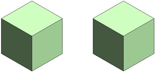
Material #1 on left,              Material #2 on right

Hidden Line Visual Style

Shaded Visual Style

Consistent Colours Visual Style

The colour displayed for material #1 (left) in Realistic and Ray Trace visual styles is different to shaded and consistent colours because the material properties do not match - this is to be expected.

Realistic Visual Style

Ray trace Visual Style

Material #1 on left,              Material #2 on right


Lighting

These views are lit with default sun and lighting settings (ie. light source over the right shoulder of the viewer)


Use Render Appearance

One thing that users often forget to address is consistency between the 'Graphics' and 'Appearance' colours.  If the colours are dramatically different, then materials look completely wrong, particularly in 'Shaded' views.

There is a quick and easy way to deal with this - it is the 'Use Render Appearance' checkbox to make sure the shaded colour matches the appearance colour.


This property can be used as a one-off operation - ie, tick the box to change the colour, then untick it.

Or you can just leave it ticked if you want the shading to update when the appearance property might change in the future.

  • NB.  Make sure that the appearance colour is correct first - as there is no 'Undo' so you might lose a shading colour definition.
  • Do not use this method if the shading colour is correct but appearance wrong


Surface Patterns in Materials

When you add surface patterns to materials is where things get more complicated . . .

We will make two more materials, based on the light green shaded material - these will use the same light green 'Appearance' (unchanged).

Material 3 - Demo Green Line Hatching

  • Light green shading 
  • Light green appearance;  
  • Line Cross-Hatching foreground surface pattern

Material 4 - Demo Green Solid Hatching

  • Light green shading 
  • Light green appearance;  
  • Line Solid Fill foreground surface pattern

Visual Styles

Hidden Line

  • Cross-hatch pattern is displayed as you might expect
  • Solid fill displays with solid colour - but without any lighting effects
Material #3 on left,              Material #4 on right

Hidden Line Visual Style

Shaded

  • Cross-hatch pattern is displayed on top of the shading colour
  • Solid fill displays replaces the shading colour - it is completely obscuredthis can be confusing if the user has not studied the material properties carefully
Shaded Visual Style

Consistent Colours Visual Style

Realistic (and Ray Trace)

  • Cross-hatch pattern are not displayed at all - unless a hatching pattern is defined within the material appearance (not a simple thing to achieve)
  • Appearance Colour replaces the Solid fill colour this is the reverse of what happens in a Shaded visual style - so it can be confusing
Realistic Visual Style


Background Hatching

Just for the record, here is what happens with background hatching - it follows the same rules as Foreground hatching.  [NB. This capability was added in Revit v2019]

Material 5 - Demo Green Line Background Hatching

  • Light green shading 
  • Light green appearance;  
  • No foreground hatching surface pattern
  • Line Cross-Hatching background surface pattern

Material 6 - Demo Green Line Foreground & Solid Background Hatching

  • Light green shading 
  • Light green appearance;  
  • Line Cross-Hatching foreground hatching surface pattern
  • Solid Fill background surface pattern

Visual Styles Materials 5 & 6

Material #5 on left,              Material #6 on right

Hidden Line

Shaded

Consistent Colours

Realistic


Conclusion

Solid Fill surface patterns are the one part of this Visual Style issue that cause display inconsistencies.

You may have good reasons for using Solid Fill surface patterns as part of a material definition - in which case go for it.  Otherwise, they are to be used with caution in normal Revit use.

Another approach to avoid the inconsistencies would be to make sure the appearance, shading and solid fill colours all match up.


Don't forget to check how many materials are sharing the Appearance asset before you change it - it is the number above the hand on the Appearance tab.


Thursday, 12 January 2017

Underline Revit Schedule Headings

I was recently asked if it is possible to just underline the Revit schedule column titles without having all the lines/boxes below.  At first I thought it was not possible, so I figured out a crazy workaround.  As I was checking the workflow for documenting it on this blog I discovered something I didn't know (or at least had forgotten but once knew), which made the solution quite easy.  I have always found that preparing conference presentations is a great way of learning a subject thoroughly - instead of thinking that you know it all.  It seems that writing a blog has the same benefit.

I decided to document the workaround here anyway because someone might learn something in the process, or be able to use it for some other purpose.  If you just want to know the best solution, skip to 'The Correct Workflow'

Underline Workaround Method

When you first place a schedule on a sheet, you get some pretty uninspiring looking graphics - all boxed in, with the heading text centre justified and the body text left justified.
Default schedule appearance
If you look at the schedule 'Appearance' properties, the default settings show Grid lines on, Outlines off.  Depending on your project template, you may have the same text type for all three aspects of the schedule text - in which case it is wise to create separate text types for title, header and body text, making sure they are named clearly.
Default schedule appearance settings
 You could try turning on the Outline and hiding the gridlines to see if it underlines the title/header.
Outline on, gridlines off
Unfortunately it does not underline either the title or headers - those settings are very crude, giving us very little control at all.  The end result is a box around the whole schedule.
Outline on, gridlines off
The next thing to try is to switch off the outline box, then underline the header text itself.  You could select the header text in the schedule view, and change its font properties
Selected text font properties
However, it is much better practise to use a specific text type for the header and edit the type properties for it - so you can change them all at once without having to select the text in the schedule cells.
Text type properties
The end result is that individual header text words are underlined, which looks awful - we are trying to get one single line under the whole lot.
Header text underlined
How about using the schedule formatting tools introduced in Revit 2014?
  • First edit the Schedule Header text type to remove the underline.
  • Then highlight all the header cells by dragging the cursor across them - this has to be done in Schedule edit mode, not in sheet view.

Select all the header text cells
  •  Click on the Borders icon on the ribbon.
  • This opens the Edit Borders dialog box
  • Select the linestyle you want the underline to be
  • Click on the border box to the lower left with cells underlined
  • Click OK
  • Assuming that you switched off the 'Gridlines' and 'Outline' checkboxes, you still won't see the borders on the header cells (or any borders at all).
  • Enable the 'Gridlines' checkbox, and you get all the gridlines back again (not just the header underline borders.
  • This was the point at which a gap in my knowledge caught me out, so I devised the crazy workaround.  I thought that you could not control the borders on individual cells in the body of the schedule because the Borders icon was greyed out as soon as you select one or more cells - more on that later.

Crazy Workaround

Don't follow these steps!
  • First I created a white coloured linestyle
  • Then set the linestyle for 'Gridlines' to be the white linestyle
  • For this to work it requires the 'Blank row before data' checkbox to be ticked
White line gridlines plus blank row before data
  • Hey presto - the gridlines are there, but you can't see them as they are white on a white screen (of course it won't work if you changed your background colour).
  • The header cells should be underlined because those cells had a black border

The Correct Workflow

This is how you should do it - so much simpler:
  • Set the gridlines linestyle back to something sensible like 'Thin Lines', making sure that 'Gridlines' is ticked
  • What I didn't realise earlier is that you can modify the border lines on all the cells by selecting the columns at the top of the schedule, by clicking on the letters at the top - just like Excel.  Duh!
  • Select all the columns by running the cursor along the row of letters
Select all columns
  •  Click on the Borders icon on the ribbon
  • Click on the 'None' icon
None borders on all cells
  •  Select the Title cell and set its cell borders to None
  • Select just the header cells
Select all the header text cells
  • Click on the Borders icon on the ribbon
  •  Select the linestyle you want the underline to be
  • Click on the border box to the lower left with cells underlined
Underline border
  • Make sure that 'Blank row before data' is ticked otherwise the Header cell underline borders will not show - this is the useful tip I discovered in my crazy workaround that also applies to this method
Grid in headers/footers/spacers
  • Also untick the 'Grid in headers/footers/spacers' checkbox otherwise you'll get vertical gridlines in the blank row (as above)
Appearance formatting
  • Select each column and change its horizontal alignment as you require
Align columns
  • Finally you should get the desired result
Underlined headers
  • If you want to have some fun you can shade alternate columns.  I don't believe there is a way to shade alternate rows, which is something people do in Excel occasionally.
Alternate columns shaded

The moral of this tale is that we now have two different ways of controlling the gridlines on Revit schedules - they do not work well together.  Basically you can opt not use the old controls unless you want very simple formatting that happens to match the old options (All gridlines or just an outline box).  If you want to use the new border tools then you need to make sure the old gridline checkboxes are set to the default settings (as shown above).

Wednesday, 15 June 2016

Revit 2017 Elevation Depth Cueing Pt 2

A few weeks back I reviewed the new Revit 2017 feature of Elevation Depth Cueing.
I have since realised that I may not have been entirely fair in how I portrayed this feature, particularly in regard to line weights . . .

The whole concept of applying different line weights according to distance from the cut plane is not as simple as you might think.  If Revit tried to apply thinner lines in the distance, how would it handle angled walls?  Or curved walls?  Should the line thicknesses taper as the angled/curved wall receded in the distance?  That could be pretty tricky to achieve, and the rules would be very hard to decide, let alone implement.  Or would you like an angled wall to start off one thickness close up to you, then step to a thinner line weight further back, and then step again - certainly not, that would look terrible.

So, on reflection, perhaps Autodesk chose the right option, which was to fade the lines instead of messing with line thicknesses?  It certainly is a simpler solution, which follows obvious rules and it does so more or less as you'd expect - with the exception of not applying to anything modified by the Linework tool, which I would prefer it to do.

Angled Walls

Here is a sample elevation of an angled wall - it handles the gradation very well.  Just imagine how it might look with changing line weights.

The same goes for a curved wall:
 

Conclusion

This may not be the tool that you expected, because it does not follow traditional drafting conventions of using line weights to convey distance.  However, it does very neatly handle all kinds of situations and view types (hidden line, shaded, realistic, shadows etc).  The controls over how it manages and defines the changes in distance may be very simplistic, but they are simple to understand once you look at the help file diagrams.

If we wanted a more complex solution, it would have been a lot more complicated to use, and I suspect we might still be waiting.

Click here for comments on other Revit 2017 features.