BILT Speaker

BILT Speaker
RevitCat - Revit Consultant

Saturday, 25 December 2021

Upgrading to Revit 2022 and Windows 10

Way back in 2016 I posted about my dislike of Windows 10 (not to mention 8 and 8.1 which I thought were diabolical).  I resisted upgrading from Windows 7 for several more years - even after Microsoft ceased support for that version.  Many IT Managers around the world followed the same strategy until official support stopped - whereupon they were forced to move to Windows 10.

My reasons for disliking Windows 10 were nothing to do with "resisting change" - after all I have been an avid beta tester of Revit for many years, and usually installed new versions within hours of release (well, maybe not for use on live projects . . . , as that might be considered foolhardy).  I had genuine reasons for criticising Windows 10 - which I won't describe here, as it is now past history.

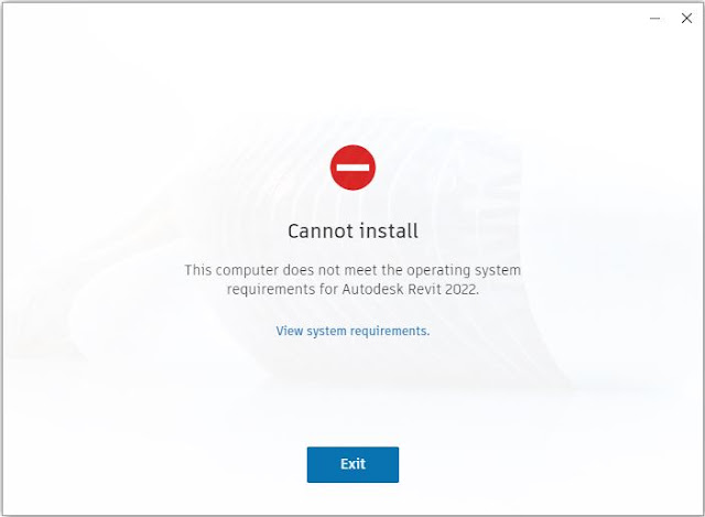
Revit 2022 on Windows 7

This year, Autodesk forced the issue:

Not only did Autodesk cease to support Windows 7 but they actively prevented me from installing Revit 2022.

Well, I knew it was going to happen some day - in fact I was surprised to be able to keep Windows 7 running for so many years.

Time to bite the bullet and upgrade.  In the end, I decided that it was also time for a new laptop - and it would be simpler to buy a new Windows 10 computer to install and run Revit 2022 and later versions.

For the record, I still don't like Windows 10 even after becoming quite accustomed to it over the months.   Perhaps I should skip it and upgrade to Windows 11, now that Autodesk support running Revit on 11 . . . . . . ?

Surely Windows 11 has to be better than 10?  Hmmm, Microsoft do not have a good record on consistently improving their software over the years - although they have made a number of improvements , with occasional good milestone versions:

  • Windows 3 was a huge improvement on MsDos -  oops, should I be admitting to remembering that transition?
  • There were several different versions for home users and networks of varying degrees of success and confusion . . . (95, 98, 2000, NT etc)
  • Windows 7 finally brought them all together in one solid version.
  • And then Microsoft started trying to make Windows more like hand-held device operating systems - and we have a half-baked mongrel OS that is neither a serious work platform nor a simple user-friendly UI.

Oh well, I lost the battle - but it was fun while it lasted.


Wednesday, 24 November 2021

Revit Mirror Command is So Not BIM

 What is one of the first things that you teach people who are moving from Autocad to Revit?

"When making changes in Revit, DO NOT delete and replace elements - you should always modify the original elements even if it takes longer" 

Why is that?  Because you never know what data or hosted elements are attached to existing elements - so if you "Delete and Replace" you might lose the data or hosted elements.

  • What does the middle initial of BIM stand for?  "Information".
  • Without "Information" you are just working with a 3D Building Model

Revit Mirror Command

Revit is a BIM program, Right?

So you would imagine that it's fundamental command structure would work towards maintaining the BIM concept?

Unfortunately the "Mirror" Command in Revit doesn't follow the BIM rules.

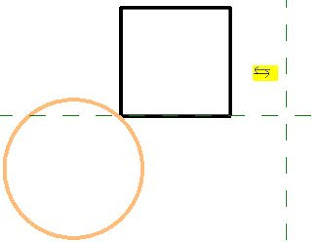
It does not just mirror the selected element(s) - it copies and deletes original, even when Copy is unticked.

  • Select an element
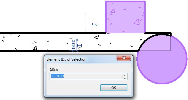
  • Check it's Element ID

  • Mirror the element (with "Copy" unticked)
  • Check the Element ID of the mirrored element
  • Aargh, it is different

So what?  Well, it is just not BIM !


What does this Mean for your model?

Cut elements are no longer cut when mirrored

Joined elements are no longer joined when mirrored

etc

To test this:

  • Create a new family that has "Cut with Voids When Loaded" enabled:

  • Place a solid and void in the family (not intersecting each other)

  • Load the family into a project
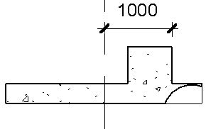
  • Place a component where it intersects with another element (in this example, a wall of the same material)
  • Join the component and the other element (wall)
  • Cut the component and the other element (wall)
  • Mirror the component (No copy)
  • Component is no longer joined or cut

Compare to other Revit Commands

  • Undo the mirror command
  • Test the Move and Rotate commands (no copy)
  • Join and Cut are maintained


These commands are BIM compliant - original elements are manipulated

Hosted Elements are Deleted by Mirror Command

  • Add a dimension (or tag) to the component
  • Mirror (no copy) the component
  • If you are lucky you might get a warning about the impending loss of the hosted dimension


What to Do?  Is there a Workaround?

The first thing to do is to contact Autodesk and request that they fix this un-BIM-like behaviour

Despite this problem having existed for over 20 years, it will surely be fixed promptly for you if you ask nicely.

In the meantime . . . . .

There is another way to mirror components in Revit:


Control the Mirror Command

Families can have their own built-in mirror/flip controls.

In the family editor, place a "Control"


  • Reload the family
  • Select the component
  • Check its Element ID


  • Click on the Mirror control
  • The component will flip around its origin point
  • Check the Element ID
  • Woohoo - it is the same! 
  • And the Join and Cut are maintained


Flipping Hosts

Test the flipping control with a hosted element (dimension)

  •  It is not guaranteed to maintain the dimension, but you have a much better chance

Conclusion

Is this going to help you?

Maybe:

  • Obviously it only allows you to flip components one by one.
  • As the flip controls will mirror about the component origin, it may not end up exactly where you need it - but you can then move it

  • It will try to maintain any cutting and joining that you have done
  • It may warn you that joined elements no longer intersect - and you should have the option to unjoin or maintain the join (if the elements will later intersect again)
  • I have not tested the implications for Dynamo - I have no idea if it is possible to access the flip controls within Dynamo.

Revit Ideas Wishlist

There are already a couple of ideas relating to this on the Autodesk Revit Ideas Wishlist

Mirror Not Copy (for mechanical elements but applies to all)

MirrorElement Not Copy API


Wednesday, 13 October 2021

Double-Click Trouble in Revit

In Revit 2019, one of the fantastic new features was the ability to slow double-click to rename views in the Project Browser !  

Fantastic?  Not true - it is an almost universally hated new feature.  If you search on the internet, you will find an endless list of questions and answers on how to disable this feature.

I do know one person (who shall remain nameless) who claims to like this feature - but they are only one amongst thousands (or even millions) who hate it.

Beta Testing

I remember reading about this feature during beta testing of Revit 2019.  Many of the testers pleaded with Autodesk NOT to roll this feature out, as we knew it would cause trouble.  However, it was too late - the code was already in the software.  Autodesk did relent somewhat, and offered us a way to disable it by editing the revit.ini file, to add the line (in the [User Interface] section):

SlowDoubleClickInProjectBrowser=0

Of all the many online descriptions of how to disable this feature, here is a link to one of them, written by Pieter Schiettecatte on Dan Stine's blog:

BIM Chapters 

Default Setting

Now why did Autodesk make the ridiculous mistake of making the default behaviour different from previous versions?  I would guess that it was to make the change "discoverable" - but it is very annoying that we have to actively disable it.

In contrast to this,  despite much pleading, Autodesk refuses to change one other default behaviour that causes much Revit-misery:

Why, oh why can't they make the "Little Button of Evil" disabled by default?  Yes, that is the "Drag Elements on Selection" setting.

More Double-Click Trouble

Another irritating double-click feature that was added in Revit 2013 was the ability to take you straight into the Family Editor when you try to select a component in Revit.  For various reasons this might register as a double-click - particularly when you try to edit a tag value, for example.  What a huge time-waster that it opens the Family Editor when you clearly do not want to edit the family.

 This was another feature that we asked them not to include after beta testing it - to no avail.

Again, Autodesk relented, but it was not until a couple of releases later (so we had to live with it for a while).

Now you can either edit the Revit.ini file or better still, go to the Revit Options to choose what double-click behaviour you would like.


These settings get saved into your Revit.ini file, so they can be rolled out to an organisation:

[UserInterface]
DoubleClickFamily=EditType
DoubleClickSketchedElement=EnterEditMode
DoubleClickViewOnSheet=ActivateView
DoubleClickOutsideViewOnSheet=DeactivateView
DoubleClickAssembly=EnterEditMode
DoubleClickGroup=EnterEditMode
DoubleClickComponentStairs=EnterEditMode


I prefer a Double-Click on a component to either do nothing or to 'Edit Type' - but never, ever edit the family.  That should only be done as a very conscious decision of right-clicking or clicking on a command on the Ribbon menu.


Saturday, 25 September 2021

Revit 2022.1 So Good it Trashed the Installer

 Excited by all the hype about Revit 2022.1, I just downloaded and installed it.

All went well apart from a couple of minor glitches:

1 - Parallel Installs

It decided that it could not install more than 33%, and sat there for ages before announcing that it had failed due to some other install going on.  I have no idea what it was - some kind of system update, which required a reboot?

After rebooting the computer the install worked smoothly and quickly

2 - Trash the Installer

After completion, I decided to make a backup of the installer software and remove it from the hard-disk to save space - all 851 Mb of it.

Where the heck was it?  I searched high and low - in the Download folder?  In the Software folder that I had previously moved it to?  No.  

Eventually I found it in the 'Recycle Bin'.  How did it get there?


I may be getting a bit forgetful, but I surely would know if I had somehow deleted the installer?

Could it be that Autodesk have built this "Self-Destruct" capability into the installer?

Or could it be some new trick that Windows 10 performs?

Conclusion

If you want to save time, reboot your computer, and then make a backup of before installing this update.

Now I look forward to testing the new features

Sunday, 15 August 2021

Display Priorities of Solid Fill in Revit Materials

Back in Revit 2012 Autodesk changed the way materials work - so that they had separate graphics and appearance properties.  This was the start of much confusion for many users - and still to this day it catches people out.  You know the drill:  duplicate a material;  change its appearance properties and suddenly a hundred other materials change too . . . .

Well, I am not going to address that issue directly.  Instead I want to look at a more subtle confusion that some users encounter:  Exactly how do the different material properties display in each 'Visual Style' - it will not always be what you might expect or consider to be logical

Material Properties

In order to analyse this issue we start with two very simple material definition examples, applied to two elements in a Revit project:

Material 1 - Demo Generic

  • Light grey shading 
  • Light Blue appearance (different colour to shading)
  • no surface patterns


Material 2 - Demo Green

  • Light green shading and appearance;  
  • no surface patterns


Visual Styles

These materials display as expected in the various 'Visual Styles' in Revit - because we know that the graphic 'Shading' colour property matches the 'Appearance' colour property in material #2 but not in #1 

Material #1 on left,              Material #2 on right

Hidden Line Visual Style

Shaded Visual Style

Consistent Colours Visual Style

The colour displayed for material #1 (left) in Realistic and Ray Trace visual styles is different to shaded and consistent colours because the material properties do not match - this is to be expected.

Realistic Visual Style

Ray trace Visual Style

Material #1 on left,              Material #2 on right


Lighting

These views are lit with default sun and lighting settings (ie. light source over the right shoulder of the viewer)


Use Render Appearance

One thing that users often forget to address is consistency between the 'Graphics' and 'Appearance' colours.  If the colours are dramatically different, then materials look completely wrong, particularly in 'Shaded' views.

There is a quick and easy way to deal with this - it is the 'Use Render Appearance' checkbox to make sure the shaded colour matches the appearance colour.


This property can be used as a one-off operation - ie, tick the box to change the colour, then untick it.

Or you can just leave it ticked if you want the shading to update when the appearance property might change in the future.

  • NB.  Make sure that the appearance colour is correct first - as there is no 'Undo' so you might lose a shading colour definition.
  • Do not use this method if the shading colour is correct but appearance wrong


Surface Patterns in Materials

When you add surface patterns to materials is where things get more complicated . . .

We will make two more materials, based on the light green shaded material - these will use the same light green 'Appearance' (unchanged).

Material 3 - Demo Green Line Hatching

  • Light green shading 
  • Light green appearance;  
  • Line Cross-Hatching foreground surface pattern

Material 4 - Demo Green Solid Hatching

  • Light green shading 
  • Light green appearance;  
  • Line Solid Fill foreground surface pattern

Visual Styles

Hidden Line

  • Cross-hatch pattern is displayed as you might expect
  • Solid fill displays with solid colour - but without any lighting effects
Material #3 on left,              Material #4 on right

Hidden Line Visual Style

Shaded

  • Cross-hatch pattern is displayed on top of the shading colour
  • Solid fill displays replaces the shading colour - it is completely obscuredthis can be confusing if the user has not studied the material properties carefully
Shaded Visual Style

Consistent Colours Visual Style

Realistic (and Ray Trace)

  • Cross-hatch pattern are not displayed at all - unless a hatching pattern is defined within the material appearance (not a simple thing to achieve)
  • Appearance Colour replaces the Solid fill colour this is the reverse of what happens in a Shaded visual style - so it can be confusing
Realistic Visual Style


Background Hatching

Just for the record, here is what happens with background hatching - it follows the same rules as Foreground hatching.  [NB. This capability was added in Revit v2019]

Material 5 - Demo Green Line Background Hatching

  • Light green shading 
  • Light green appearance;  
  • No foreground hatching surface pattern
  • Line Cross-Hatching background surface pattern

Material 6 - Demo Green Line Foreground & Solid Background Hatching

  • Light green shading 
  • Light green appearance;  
  • Line Cross-Hatching foreground hatching surface pattern
  • Solid Fill background surface pattern

Visual Styles Materials 5 & 6

Material #5 on left,              Material #6 on right

Hidden Line

Shaded

Consistent Colours

Realistic


Conclusion

Solid Fill surface patterns are the one part of this Visual Style issue that cause display inconsistencies.

You may have good reasons for using Solid Fill surface patterns as part of a material definition - in which case go for it.  Otherwise, they are to be used with caution in normal Revit use.

Another approach to avoid the inconsistencies would be to make sure the appearance, shading and solid fill colours all match up.


Don't forget to check how many materials are sharing the Appearance asset before you change it - it is the number above the hand on the Appearance tab.