BILT Speaker

BILT Speaker
RevitCat - Revit Consultant
Showing posts with label light. Show all posts

Sunday, 15 August 2021

Display Priorities of Solid Fill in Revit Materials

Back in Revit 2012 Autodesk changed the way materials work - so that they had separate graphics and appearance properties.  This was the start of much confusion for many users - and still to this day it catches people out.  You know the drill:  duplicate a material;  change its appearance properties and suddenly a hundred other materials change too . . . .

Well, I am not going to address that issue directly.  Instead I want to look at a more subtle confusion that some users encounter:  Exactly how do the different material properties display in each 'Visual Style' - it will not always be what you might expect or consider to be logical

Material Properties

In order to analyse this issue we start with two very simple material definition examples, applied to two elements in a Revit project:

Material 1 - Demo Generic

  • Light grey shading 
  • Light Blue appearance (different colour to shading)
  • no surface patterns


Material 2 - Demo Green

  • Light green shading and appearance;  
  • no surface patterns


Visual Styles

These materials display as expected in the various 'Visual Styles' in Revit - because we know that the graphic 'Shading' colour property matches the 'Appearance' colour property in material #2 but not in #1 

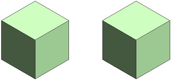
Material #1 on left,              Material #2 on right

Hidden Line Visual Style

Shaded Visual Style

Consistent Colours Visual Style

The colour displayed for material #1 (left) in Realistic and Ray Trace visual styles is different to shaded and consistent colours because the material properties do not match - this is to be expected.

Realistic Visual Style

Ray trace Visual Style

Material #1 on left,              Material #2 on right


Lighting

These views are lit with default sun and lighting settings (ie. light source over the right shoulder of the viewer)


Use Render Appearance

One thing that users often forget to address is consistency between the 'Graphics' and 'Appearance' colours.  If the colours are dramatically different, then materials look completely wrong, particularly in 'Shaded' views.

There is a quick and easy way to deal with this - it is the 'Use Render Appearance' checkbox to make sure the shaded colour matches the appearance colour.


This property can be used as a one-off operation - ie, tick the box to change the colour, then untick it.

Or you can just leave it ticked if you want the shading to update when the appearance property might change in the future.

  • NB.  Make sure that the appearance colour is correct first - as there is no 'Undo' so you might lose a shading colour definition.
  • Do not use this method if the shading colour is correct but appearance wrong


Surface Patterns in Materials

When you add surface patterns to materials is where things get more complicated . . .

We will make two more materials, based on the light green shaded material - these will use the same light green 'Appearance' (unchanged).

Material 3 - Demo Green Line Hatching

  • Light green shading 
  • Light green appearance;  
  • Line Cross-Hatching foreground surface pattern

Material 4 - Demo Green Solid Hatching

  • Light green shading 
  • Light green appearance;  
  • Line Solid Fill foreground surface pattern

Visual Styles

Hidden Line

  • Cross-hatch pattern is displayed as you might expect
  • Solid fill displays with solid colour - but without any lighting effects
Material #3 on left,              Material #4 on right

Hidden Line Visual Style

Shaded

  • Cross-hatch pattern is displayed on top of the shading colour
  • Solid fill displays replaces the shading colour - it is completely obscuredthis can be confusing if the user has not studied the material properties carefully
Shaded Visual Style

Consistent Colours Visual Style

Realistic (and Ray Trace)

  • Cross-hatch pattern are not displayed at all - unless a hatching pattern is defined within the material appearance (not a simple thing to achieve)
  • Appearance Colour replaces the Solid fill colour this is the reverse of what happens in a Shaded visual style - so it can be confusing
Realistic Visual Style


Background Hatching

Just for the record, here is what happens with background hatching - it follows the same rules as Foreground hatching.  [NB. This capability was added in Revit v2019]

Material 5 - Demo Green Line Background Hatching

  • Light green shading 
  • Light green appearance;  
  • No foreground hatching surface pattern
  • Line Cross-Hatching background surface pattern

Material 6 - Demo Green Line Foreground & Solid Background Hatching

  • Light green shading 
  • Light green appearance;  
  • Line Cross-Hatching foreground hatching surface pattern
  • Solid Fill background surface pattern

Visual Styles Materials 5 & 6

Material #5 on left,              Material #6 on right

Hidden Line

Shaded

Consistent Colours

Realistic


Conclusion

Solid Fill surface patterns are the one part of this Visual Style issue that cause display inconsistencies.

You may have good reasons for using Solid Fill surface patterns as part of a material definition - in which case go for it.  Otherwise, they are to be used with caution in normal Revit use.

Another approach to avoid the inconsistencies would be to make sure the appearance, shading and solid fill colours all match up.


Don't forget to check how many materials are sharing the Appearance asset before you change it - it is the number above the hand on the Appearance tab.


Wednesday, 15 June 2016

Revit 2017 Elevation Depth Cueing Pt 2

A few weeks back I reviewed the new Revit 2017 feature of Elevation Depth Cueing.
I have since realised that I may not have been entirely fair in how I portrayed this feature, particularly in regard to line weights . . .

The whole concept of applying different line weights according to distance from the cut plane is not as simple as you might think.  If Revit tried to apply thinner lines in the distance, how would it handle angled walls?  Or curved walls?  Should the line thicknesses taper as the angled/curved wall receded in the distance?  That could be pretty tricky to achieve, and the rules would be very hard to decide, let alone implement.  Or would you like an angled wall to start off one thickness close up to you, then step to a thinner line weight further back, and then step again - certainly not, that would look terrible.

So, on reflection, perhaps Autodesk chose the right option, which was to fade the lines instead of messing with line thicknesses?  It certainly is a simpler solution, which follows obvious rules and it does so more or less as you'd expect - with the exception of not applying to anything modified by the Linework tool, which I would prefer it to do.

Angled Walls

Here is a sample elevation of an angled wall - it handles the gradation very well.  Just imagine how it might look with changing line weights.

The same goes for a curved wall:
 

Conclusion

This may not be the tool that you expected, because it does not follow traditional drafting conventions of using line weights to convey distance.  However, it does very neatly handle all kinds of situations and view types (hidden line, shaded, realistic, shadows etc).  The controls over how it manages and defines the changes in distance may be very simplistic, but they are simple to understand once you look at the help file diagrams.

If we wanted a more complex solution, it would have been a lot more complicated to use, and I suspect we might still be waiting.

Click here for comments on other Revit 2017 features.


Monday, 25 April 2016

Elevation Depth Cueing in Revit 2017

This is a new feature in Revit 2017, which has long been on many architectural user's wishlist.  OK, lets do some testing and see if we are ready to take it off the wishlist yet?. . . . .

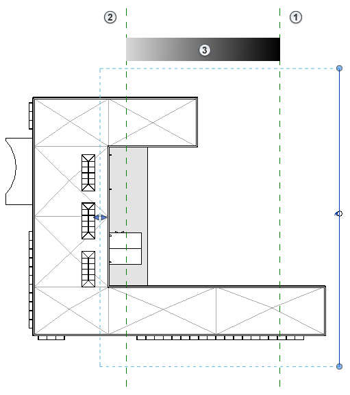
  • First I set up a series of walls that are stepped in plan, with a few windows in the walls.
  • Then created an elevation view looking at the walls and windows
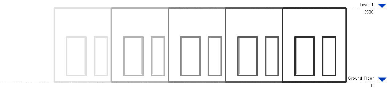
  • In order to examine what is going on with depth cueing, I needed to artificially bump up the line weights of the elevation - in Object Styles:

  • Oh, if you are one of those people that likes to read manuals before trying something out, there are some interesting notes in the Autodesk Help files:

Autodesk Help:  

Depth cueing...
  • applies to model elements, and graphic display effects, such as shadows and sketchy lines.
  • does not apply to annotation elements, line weight, linework, background image, or background color.

After applying depth cueing to a view, you can do the following:
  • Export the view to an image file.
  • Print the view (raster processing only).
  • Add the view to a sheet.

Alarm bells

Any alarm bells ringing yet?  Does not apply to Lineweight or linework;  Raster processing only.
So, if you are the sort of person who likes to use lineweights  to give your drawings depth and readability, perhaps you'd better stop reading now?  Or maybe go and have a little cry?
[Edit] Or maybe you need to rethink how you expect it to work?

Here's How it Works

First go to 'Graphic Display Options' and you'll see a new item called 'Depth Cueing'

Expand it and you'll see some sliders.  By default it will be off, so you need to tick the checkbox.
Unlike the Sketchy Lines feature, you will get an instant result after clicking Apply, without having to adjust the sliders.  Notice how the walls furthest away become lighter and lighter - which is the desired effect, you might think.  But look closer and you'll see that the lines are not getting thinner - just lighter.  This shows up quite well in the image below because I have bumped up the line weight.

The effect is more subtle if you have thin lines and no wall hatching (closer to a typical elevation)

If you adjust the 'Fade Limit %' (lower) slider, the degree of fade is reduced
50% Fade

If you put it up to 100%, you get no fade at all - effectively turning off Depth Cueing:
100% Dark (No Fade)

Not Fade Away

The top slider 'Fade Start/End Location' is actually well described in the Autodesk Help notes - to my astonishment, I found not only an image but a meaningful description that told me how it works, and what it does, rather than the usual one-liner telling me that the feature exists.  Gold Star to whoever wrote that help page.  So I will not go into any detail on how to use it here.
Autodesk Help - graphic explaining Depth Cueing Fade Start/End Location
One of things it states is:
"at Fade Limit 0%, elements that are farthest away could be invisible. In most cases, you want to set a percent greater than 0 to ensure that elements can be seen and printed, if desired."

If you have the Fade Limit at zero (default setting), and start adjusting the 'End Location' (right-hand side of top slider) - sure enough, things start disappearing.
End Location 75%, Fade Limit 0%

Add this to the list of reasons why things are not displayed in Revit!  The list is well over 30 possible reasons by now.  It begs the question, Why did they make the default Fade Limit 0% instead of something safer like 10%, say?

Graphic Display Effects

The help notes state that Depth Cueing works with graphics display effects like shadows.  Yes, it seems to work

I tried enabling the Silhouette setting, and this is where it started getting weird

As I had the wall lines set to a very heavy lineweight, I tried a thinner silhouette, which is the wrong way around from normal - but it showed a couple of glitches:
  • Strange dots at the corners of windows - I guess they might be wall edge lines seen end-on where the silhouette has not been applied?  A bug, I guess.
  • The actual wall edges are showing a thin line (the silhouette) in front of the greyed out depth cue line, which is still shown at full line width behind it.  The silhouette line is somewhat greyed out but not as much as the depth cue line.
  • But why does Revit consider wall opening edges to be silhouettes anyway?  They are not as significant as the actual wall outlines - I would normally want them to remain unaffected by the silhouette feature.
The first two issues would not show up if you reversed the line weights so that Silhouettes are thicker than normal elevation line weights.  However, the window opening lines are still treated as silhouettes.  To solve this you might try the next tool in your arsenal:

Linework Tool

As the help file states, Linework is not affected by Depth Cueing.  'Tis a pity!  And not pretty!

Sliding View Templates

The help files state that you can include Depth Cueing in view templates for similar elevations and sections.  I have not tested this but my gut feeling tells me that the use of the sliders is a very hands-on operation to be done while looking at each elevation and playing around with the settings until it looks right.  I'd be surprised if Depth Cueing and view templates will be good playmates.

One of the issues with standardising these sorts of settings is that outcome depends very much on the view depth and the distance of the cut line from the actual walls (or other elements) - both of which could vary tremendously between different elevations controlled by the same view template.  If you change the 'Far Clip Offset' value in a section of elevation, it can have a radical effect on the Depth Cueing - transforming the look of the view, which means it could be hard to maintain a consistent look and feel for elevations on a project.

[Edit]

Shaded Views

I just realised that I have been unfair in not showing how effective Depth Cueing is when used on shaded or realistic views in Revit.  Obviously line weights are less relevant in this kind of view.

And it works well when you include entourage or landscape families

 And also works with RPC content in realistic views

I should point out that Depth Cueing is not available for 3D or perspective views;  Nor is it available for plan views, which means that we still have to rely on View range 'View Depth' settings and 'Beyond' linestyles to control that.

[Edit again]

Angled & Curved Walls

Click here to read more about angled and curved surfaces in elevation.  It seems that there may be good reasons for Autodesk to choose this method of conveying distance in elevation rather than diminishing line thicknesses - namely how it handles curved and angled walls, which would be very tricky with varying line weights.
Angled wall with depth cueing - works well

Conclusion

You will have to draw your own conclusions as to whether this new feature is going to work for you - I couldn't possibly comment!  I think this may be yet another example of needing to wait until the various shortcomings are fixed in the next version or two before we can take it off the wishlist.

This new feature adds to the growing list of  situations where the control of line weights and printed outcome is hard-coded into Revit, and we cannot do much about it.  Refer to Weird Stuff with Line Weights  and Hatching Pattern Line Weights.

Link: Other New features in Revit 2017