BILT Speaker

BILT Speaker
RevitCat - Revit Consultant

Sunday, 29 October 2017

New in Revit 2018.2 - Pattern Dialog Box


Following on from my last post about new features in Revit 2018.2, there are some very nice tweaks to the Pattern dialog boxes:

Fill Patterns

  • The Fill Pattern dialog box is now fully resizable (height & width) - Revit remembers the resize operation during the session.
  • The Fill Pattern dialog box has been redesigned to replace text icons with visual icons - as per many other Revit dialog boxes.
Revit 2018.2 dialog box
 
Old dialog box

  • No Pattern <None> is now at the top of the list (when accessed from a dialog box that has the option to remove a pattern, such as the Material dialog box) - this replaces the 'No Pattern' button at bottom left of the old dialog box.
  • Solid Fill is now second from the top of the list (Drafting patterns) after 'No Pattern' - generally I think this is a good thing.  NB. This is not the case with the Override dialog boxes, which have not yet been redesigned - so we have another new inconsistency.

  • There is now a Search/Filter function for patterns - it will filter the list to only include whatever contains the text you type into the 'Search' box.  It is not case sensitive.    Watch out for this feature:  if you have any text in the search/filter box, you may not see the <None> or Solid fill items at the top - it will take some getting used to, and will surely catch you out a few times.
  • It is now possible to select multiple fill patterns when the dialog box was accessed from the Manage toolbar (but not from dialogs that require you to choose a fill pattern to be used somewhere - like the material dialog box);  If multiple fill patterns are selected, they can be deleted but not edited (the edit icon is greyed out).

Edit Fill Patterns

The Edit Fill Pattern dialog box has been redesigned - the new overall layout is more logical:
Revit 2018.2 Edit Pattern dialog box
Old Edit Pattern dialog box

  • 'Simple' patterns are now labelled as 'Basic' 

  • When listing custom patterns from a pattern file, it shows 4 instead of 3.  When the dialog box is resized vertically, it only increases the size of the preview, not the list of custom patterns, so you still need to use the tiny scroll bar on the right.
  • The 'Import' button (on the left) has been replaced by a 'Browse' button (on the right) - why?
  • The Import Scale value has been unlocked so it can be changed at any time after importing - this sounds great but BIM Managers may not be happy as they will lose the ability to set and lock down pattern scales.
  • Changing the scale without re-importing is immensely useful, as we often do not know where the pattern came from.  In this situation,  the preview updates as soon as you change the scale.
  • We have lost the File Units -  Aaaargh!  Why?  I like to know if the source was metric or imperial.
  • As with the old dialog box, we cannot see the name of the imported pattern file, which would be useful.
  • We now have a search/filter function for custom patterns, which operates much like the one on the Fill Pattern dialog box - this only works immediately after importing a pattern file. 
  • The title 'Settings' seems a bit odd when the pattern is set to custom - it was obviously designed for Basic/simple patterns, where it is more appropriate.

Overall, this is a welcome change to the UI, with only a few minor quibbles.  It would be great to have many, many more such minor improvements that incrementally take away the pain of using Revit.

Friday, 20 October 2017

New in Revit 2018.2 - Family Types Memory

Here we are with a third set of enhancements for Revit this year - first version 2018, then 2018.1 and now 2018.2

There is nothing amazing - just small things as Autodesk themselves say.  I have tested a couple of things and have some comments on the first of them:

Remember Column width spacing in Type properties dialog

This one is in the Family Editor - in the Family Types dialog box (the one with four blue squares, which I never remember the name of).
When you open that dialog box, the column widths are never arranged how you want them:  The formula width is too small if you want to add formulas; the 'Lock' column is always too wide etc.
In previous versions, after you had rearranged the widths, then closed the dialog box, the next time you opened it, those darned column widths were back to standard.  In addition to this, when you make the dialog box wider, all the column widths expand; if you make the first column wider it often seems to make the 'Lock' column wider too (ridiculous for a checkbox), and then you get a very irritating horizontal slider on the dialog box - pretty soon the left hand columns disappear off screen when the focus goes into a formula . . . .

In Revit 2018.2, they have addressed just one of those problems - but only partially:  Yes, the column widths are remembered when you reopen the dialog box - sounds great but . . . .
Standard column widths

When you adjust the column widths, you have to be careful to make sure that the vertical divider line to the right of the 'Lock' title does not disappear -
Adjusted column widths to make formulas readable

Once the right hand Lock column divider disappears, you get the scroll bar along the bottom of the dialog box.  Once the whole Lock column disappears, and you put the focus in the Formula column, it shifts the Parameter Name column off screen to the left.

 If you adjust the dialog box width, it is possible to make formulas and values readable - but watch that Lock column width
Adjusted dialog box width

In version 2018.2 they have broken something in the controls for adjusting the widths and sliding the scroll bars - it is pretty flaky.  Within 10 minutes of testing I had managed to entirely lose the Lock column, so you couldn't see it even with the slider fully to the right.   I have reported this as a bug, and Autodesk have replicated the problem, so hopefully they are fixing it already.


The Bad News

  • The Dialog box column widths are only remembered per session (Actually that may not be so bad after all . . .). 
  • The annoying expanding Lock column is still annoying.
  • The nasty horizontal slider is still there, doing its worst to hinder you - I would much prefer it if the Lock column was always narrow, fixed to the right side of the dialog, while the other three columns scaled proportionally with the dialog box (at whatever width you set).

The Good News

  • The Dialog box column widths are only remembered per session. 

Yes, this really is good news because if you manage to screw up the widths on the dialog box, it all resets when you next start Revit.   Actually it is good news anyway, because it is most likely that you will want different alignments depending on your task, each time you open Revit.


Monday, 2 October 2017

Weird Railing Stuff - part 8 - Moving Handrail Supports

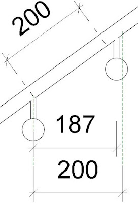
I have explained previously that Revit handrail support spacing is measured along the length of  sloping handrails, not horizontal (plan) distance.

What does this mean when it comes to moving individual supports on a handrail?  Well, the rules are equally weird, but differently weird.

In the following  example, you might want the spacing to be measured horizontally (in plan), so you need to move the supports on the sloping parts of the handrail.

The first thing to do is select just the support (Tab, select), and unpin it.  This will allow you to slide the support along handrail - but most likely you want to be very precise about how far it is moved.  You might try using the 'Align' tool, providing you have something like a reference plane to align to:

Law of Diminishing Returns


In this context, the Align tool does not do what you expect - it presents you with more Revit Weirdness.  Once you select the reference plane to align to, then click on the support centreline, it moves the support only about two-thirds of the way (this fraction probably varies depending on the slope of the railing). 


My first thought was that it was converting the horizontal distance to an actual distance up the slope of the handrail - but it is not that value (something slightly different).  It is using some other mysterious mathematical rule that I cannot fathom.

If you try Align again, it goes another two-thirds of the remaining distance.

 Try again and you get closer - but you will never quite get there.  There has to be a better way?

Move Weirdness

If you try using the 'Move' command, and select a horizontal distance, you get exactly the same result as the Align tool - it does not move it to where you tell it.  The same 'Law of diminishing returns' applies.

The Move (Workaround) Solution

The trick here is to use the move command, but make sure that you snap to the end point of the support, and then have a reference line that has an end (or intersection) point exactly where you want it to be placed - slightly above the underside of the handrail.

The Slide (Workaround) Solution

There is another trick - providing you have a (reference) line running vertically and stopping exactly where you want it to be placed (as with the previous workaround), you can just select it and slide it along the handrail, and it will snap to the right place.  However, I do not recommend this because if your reference line is too long or short, it may look like it went to the right spot but could be slightly off.  The move command is more precise.

Reset Warning

If you click on the 'Reset Rail' or 'Reset Railing' commands, you will lose all of those careful support relocations on the whole handrail - each moved support would be moved back and repinned, while deleted supports would be reinstated (including those silly ones exactly on the ends of handrails).


More on this subject: