1. Pattern Line Weights
As Frank Giorlando rightly pointed out in a comment on the previous post: Ceiling surface patterns use Line Weight 2. So, if you want to control those independently, you should start your regular line weights from #3.Thanks for that tip, Frank.
It would not surprise me if there are other categories that use different line weights again.
2. Apply Button
The "Apply" button on the Line Weights dialog box does not appear to work - so if you start changing settings for different scales and want to check what happens (with hatching lines for example), you have to click OK to close the dialog box to see the effect. I wasted a bit of time making changes that did not seem to be having any effect before I realised. (as of Revit v2016 R2)3. Grid Line Weights
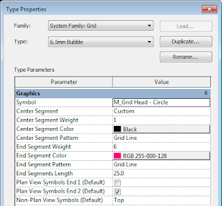
In testing the previous bug, I discovered some more weird settings:Gridlines have all sorts of hidden away weight controls -
Unlike most elements, the actual grid line weight numbers are controlled from the grid Type properties (not from the Object Styles settings). However, the Grid Heads have a master control in Object Styles where you might expect the gridlines to also be controlled
And something else I never knew: The type properties for grid lines allow you to set different line weights, colours and styles for the centre and end segments - by choosing 'Custom' Center Segment..
Why would anyone want this? I guess someone out there needs it and the programmers thought it would be useful. Personally I would have been happy to see the weight set in Object Styles, with Visibility Graphics overrides if you need them - like most other categories. This just seems like an unnecessary complication and inconsistency.
[Edit: Steve Stafford has previously blogged about how and when to use the Center Segment setting in this link. I can see that you might well want to have a gap in the grid, but I still can't imagine why anyone would want a different line weight - just to make their drawings look ugly? This also highlights the radically different way to control breaks in the middle of gridlines vs breaks in the middle of section lines - oh, I wish we had more consistency in UI and methodology in Revit]
4. Dimension Tick Line Weights
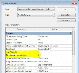
Another category where the line weights are controlled in the Type Properties is Dimension lines. The line itself and the dimension 'Tick Mark' have independent weight settings (at least both appear to be in the same place, unlike grids and grid heads).
But when you go to the arrowheads dialog box and check the settings for the Tick Mark, there is another weight control called "Heavy End Pen Weight". Now someone is showing their age by using the term "Pen" in there! Most of the time it is greyed out and has no effect, but if you cycle between the different Arrowhead Types, each one has a different value. Why?
Well, if you change the Arrow Style to 'Heavy End Tick Mark' it enables that setting and you can change the number. If you change the Arrow Style back to Diagonal or Arrow, it greys out the number but remembers it - I guess it does nothing. I decided that I do not want to know what a Heavy End Tick Mark is nor why it needs its own special setting that causes confusion to the other arrow styles - it is a 'rabbit-hole' I don't want to go down any further!
Note the mix and match of imperial and metric units that came straight out of the v2016 metric sample file. Sloppy work by someone there!
[Edit: Steve Stafford has blogged previously about when you might use Heavy End Tick Marks in this link]
Really Weird: Line weights in Perspective Views


Hi Tim - ah, Reviteristics :)
ReplyDeleteThe gridline settings permit changing a head and tail to a solid line pattern with a slightly heavier pen for firms that don't like the "grid line" extending all the way to the annotation. It also allows other firms to turn of the middle portion of the grid line. I've seen both in requirements in my travels, though not often. Wrote this post about them.
http://revitoped.blogspot.com/2015/02/gaps-in-grids.html
I quite like the Heavy End arrowhead style/type, it looks like I used a thick sharpie...pen down...pen up to mark something. I've used it for wall tagging and more often to place a leader on Room Tags. I like it better than a filled dot or regular arrow to point to a room. Can't attach images to links, have a look at this blog post to see it on a room tag.
http://revitoped.blogspot.com/2015/02/leaders-and-tags.html
Thanks Steve,
ReplyDeleteI am impressed that you had time to comment on this while compiling a mega post on what is new in v2017.
I have incorporated your links into the body of my post, so people can look at your images.