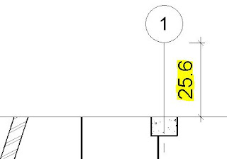
- Default extension of grid lines and levels beyond a cropped view on a sheet - this appears to be just over one inch on the sheet (I was expecting it to be exactly one inch = 25.4mm).
Why oh why does it have to be so big - all that wasted paper on plots; or wasted time adjusting each one manually.
- Tag Leader Offsets - it seems the leaders go to the opposite extreme, being really tight in to the text. If your boss does not like that graphic, you are in trouble.
Text Leader Offsets
A few years back, Autodesk actually solved a similar issue for text in Revit - although with text, prior to that the leaders had a locked in 2.032mm offset, which was equally irritating.In Revit version 2011, Autodesk added the parameter "Leader/Border Offset", which gave us the ability to control how far the leader started from the text (even when no border was applied to the text).
 |
| Default text leader offset = 2.032mm |
- If you want the leader closer in, just change the offset to 0.5mm or 0mm
 | |
| Zero mm text leader offset |
- If you want the leader further away, change the offset to something larger
 |
| Text leader offset 3.5mm |
- You can also add a border, which matches the leader offset exactly
The default offset in all the Autodesk templates is still 2.032mm, which is way too big. Likewise in all projects that were upgraded in v2011, it set the value to 2.032mm.
I wonder how many BIM Managers around the world actually went in and set the value to a sensible number? I like it to be say 0.5mm, but some people like 0mm.
Tag Leader Offsets
Sadly, Autodesk never finished that task (now where have you heard that before?).Text labels inside tags do not follow these rules – leader offset makes no difference unless the tag-label has a border enabled.
Without a border, the leader just uses the extents of the tag family, and it considers tag-text with no border to have an offset of zero regardless of what it is set to.
For some reason the vertical and horizontal offsets are not consistent. If the leader is pointing up or down the offset is visually acceptable, but when it is left or right it is just a bit too small an offset, and looks wrong.
- With no border and a large leader offset the leader is tight in to the text label
 |
| Tag label leader 3.5mm no border |
 |
| Tag label leader 3.5mm no border |
- With a small leader offset the leader is still tight in to the text label
 | |
| Tag label leader offset 0mm no border |
- The tag looks exactly the same (no leader offset)
 |
| Tag label leader 3.5mm no border |
- As soon as you add a border, the leader offset matches that border (as per text)
 |
| Tag label leader 3.5mm |
This is yet another little inconsistency in Revit to irritate you.
Does anyone know a way to address this?
Nasty Workaround
I hate to suggest this, but if your job depends on it you could try adding a border to the tag label and make it white, so it does not show on a plot/pdf (in label Type properties). Interestingly, the text remains black.But we all know what kind of trouble that might cause later on . . .


